
Interested in the best 6 mobile navigation menu examples? You have come to the right place.
In this article, we will discuss some mobile menu examples and start off with some essential features of a good mobile menu. Let's start.
In this article
- Mobile Navigation Menu Features
- Mobile Navigation Menu Examples
- Frequently Asked Questions on Mobile Navigation Menu Examples
Mobile Navigation Menu Features
Let's see what features a good mobile menu should have.
When you are competing with potentially thousands of mobile apps for the attention of users, getting noticed is not easy. Don't forget that quite a few may well be free apps too, something which will make your job even tougher.
Keeping the focus on user needs should always be your top priority when developing a mobile app. This is the golden rule and forms the foundation of success.
A good mobile menu design should meet the following criteria:
- It should be simple. To achieve this, you need to prioritize your content. Put the action buttons that users are most likely to want right at the forefront.
- Visibility should be good and convenient so that your users don't need to struggle to find/remember the action buttons they regularly require. They should just be able to see them easily on the mobile menu.
- Clarity. Your mobile menu should make it very clear to users exactly how it is to be used. The golden rule here is to keep menus simple.
- Consistency. Your menu should be in the same location for all pages so that users won't need to look around to find it.
- For certain apps, smartphone users use their thumbs to undertake actions on the screen. So, in these cases, buttons that are within easy reach of the thumb will get higher priority. Keep your important ’call to action‘ (CTA) buttons within thumb's reach. Read more about the importance of this point in “The Golden Rules Of Bottom Navigation Design”.
- You need to set your touch target to 9 mm square or greater, due to the ease of use it provides. Keep in mind that in order to accommodate people with disabilities, you can offer an option to increase the size of key buttons.
- Consider using a tab bar for the most important features. A good example is how Facebook has one in its app for the news feed.
- Some mobile screens are small. Therefore, in some cases with small screens, users scroll to see more options. While most apps cater to the more common larger screens, try to minimize the need for users to scroll.
- Remember to use universally recognized icons and layouts as much as possible.

6 Mobile Navigation Menu Examples
Let's now review some good mobile navigation menu examples.
Design pattern #1: Hamburger menu
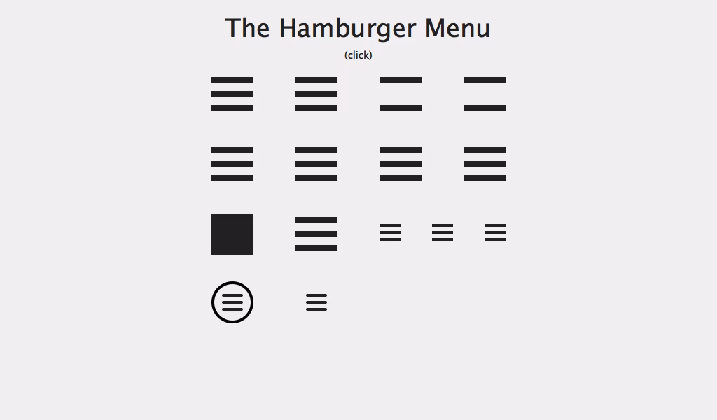
The Hamburger menu is one of the most common mobile navigation patterns. Since users often delete apps after only using them once, it is vital that an app conveys its most important features clearly; users won't see its true value.
A big reason for this problem is the lack of space on a mobile screen. As I have already touched on, it's hard to fit much information on a mobile screen. The Hamburger menu hides features behind primary action buttons. This lets you cram in far more actions/features than you would otherwise.
So, if you have one killer primary feature, which everything else is secondary to, then this mobile navigation pattern is good for you, as it allows you to put that upfront. This way, when users access your app, their focus will be on your primary feature.
After they have become familiar with the feature, they will need to click that hamburger icon at the far end of the screen to access other actions.
For e.g., Uber wants you to first locate a cab. This is its primary function. Payment and other functionalities come later and are secondary. Once users have located a cab with quick access to the primary function, they can then click the Hamburger menu to access the subsequent or secondary actions.
Read more about it in “Basic Patterns For Mobile Navigation: Pros And Cons”.
Pros and cons of the Hamburger menu
The main advantage of this menu system is that it frees up screen space. The other important advantage is the large number of navigation options it allows for. This means that users will not have to struggle with crowded menus that offer lots of choices at once.
It's also a very well-known menu pattern; hence, most users have some degree of familiarity with it.
However, there are also disadvantages to the Hamburger menu. Firstly, most features are hidden behind the primary animated menu, so users can't see them upfront. This reduces visibility and requires users to take more time to get to know your app's real potential.
Another disadvantage of this menu system is that it is more complex. Users often can‘t clearly understand where they are in the app's menu system. As a result, they must click the Hamburger dropdown menu icon to find where they are.
Being a menu icon that is located at the top of the screen, the Hamburger button is also hard to reach with the thumb.
Yet another disadvantage of the Hamburger pattern is that it conflicts with iOS navigational buttons. It fits well with Android phones; however, it gets in the way of the iOS back button, which is also located at the top left corner of the screen. This means that iOS users must either make both smaller or opt to only use one of them.
Read more about these disadvantages in “The Ultimate Guide to the Hamburger Menu and Its Alternatives”.
Design pattern #2: Tab bar
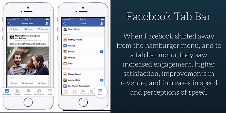
Will you have several equally important actions in your app? If you will, then you will have already identified one crucial limitation with the Hamburger menu.
Such a menu system will hide everything behind a drawer and will only show your primary action function on the screen. In such a situation, it is best to opt for a Tab bar menu design that is designed to address this situation.
Tab bars are usually placed at the bottom of the screen, with each important action being placed side-by-side within the menu. Since all these actions can be regarded as being equally important, your users should be able to access them from anywhere in the app.
This is the problem that a Tab bar solves. A typical tab bar menu is persistent, i.e., it always remains in sight. The iOS Medium app is an example of such a menu system.
1,200 top developers
us since 2016
Pros and cons of the tab navigation bar menu
A tab bar menu offers the following advantages:
- You have a viable menu at all times, unlike the Hamburger menu. Read more about this advantage in “3 Good Reasons Why You Might Want to Remove that Hamburger Menu from Your Product”.
- Mobile users can clearly access the menu at all times.
- Typical tab bar menus include recognizable icons. Even though the tab bar at the bottom of the screen is narrow, the use of such icons helps to fit in important actions that are essential to the app's function. Just imagine trying to use your mobile phone with no back button to understand why this is so important.
- Labels or colors can be used in the tab bar as easy tools to let users know where they are.
- Tab bar menus are located in the 'thumb operation zone', hence users can reach them easily even when they are holding the mobile with one hand.
There are also disadvantages of the tab bar menu, e.g.:
- If you have more than 5 actions of equal importance, then you can't fit them all in the tab bar.
- You need to use the tab bar menu in child view; otherwise, your design will confuse users. Read more about it in "Tab Bars are the new Hamburger Menus”.
- iOS and Android have different locations and options for tab bars. You need to factor in these differences while designing the app. This complicates your development process.
- Sometimes, universally recognizable icons are hard to find for certain actions/functions. Remember, unless you use easily recognizable icons, you run the risk that users won't be able to make sense of your tab bar menu.
Mobile navigation design pattern #3: The “Priority +” menu
As you no doubt have noticed, popular news magazines or technology media websites all have mobile applications. You can also imagine the sheer amount of content they have; hence, they find the limited mobile screen size a tremendous challenge.
However, the good news is that they always have priority items and important links, like breaking news, etc., to place upfront.
In this case, a tab bar isn't suitable because the app's priorities are different. Also, since such apps want to show a larger menu, the Hamburger menu doesn't work either.
In such a case, the “Priority +” menu addresses these requirements perfectly. Here, the main content is categorized clearly within the menu, while lower-priority content is hidden under a “More” button that is located at the bottom of the menu containing secondary links.
The Guardian newspaper is one example of a company that uses this mobile app navigation design.
Pros and cons of the “Priority +” menu
This responsive menu design offers the following advantages:
- It uses the limited mobile screen space for prioritized content. Read about it in “A Brief Overview of Responsive Navigation Patterns”.
- If the screen space increases, more of the priority content can be displayed.
- It is an adaptive and responsive navigation mobile menu design, i.e., scaling it for different screen sizes is easy.
The main disadvantage of this menu system is that you must prioritize certain actions. Since different users have different priorities, you will need to tailor your app menu to suit the majority rather than the minority.
Mobile navigation menu design #4: Floating Action Button
Let's assume you have one essential use focus for your app. Naturally, you would expect your users to make the most of this action most of the time; therefore, it must be prominent. In such a case, the floating action button could be the best mobile menu design option for your needs.
Android users are quite familiar with this menu system since Android uses the Material Design system. I explained earlier the distinct features of the Android Material Design. If you wish to read more, then read “How to Convert an Android App to iOS?”
This system appears as a floating circle above the intended action with hover effects. It will change colors when you focus on it and lift it when you select it. Music apps often use this approach for their play button.
Should you choose to go this route, then remember to only use one such button per screen, as you shouldn't have too many important actions per screen.
Advantages and disadvantages of ’Floating Action Button '
There are several advantages of this mobile menu animation design approach, e.g.:
- The button is very prominent; hence, it effectively directs users to the most important action.
- It takes very little screen space.
- Most designers use aesthetically pleasing colors, which produce a positive emotion in the users' minds.
- It's easier to use than traditional action buttons.
However, there are also a few disadvantages:
- Being so prominent on account of their color and design, these buttons can distract users from app content.
- Floating action buttons can only accommodate icons and no text labels. Finding a universally recognizable icon is hard; therefore, in some cases, the button can confuse users.
Read more about floating action buttons in “Floating Action Button in UX Design”.
Mobile navigation menu design #5: Full-screen navigation
Suppose you have a task-based or direction-based app; your focus will naturally be on creating a precise direction to guide users to content. Full-screen navigation is an excellent option in such cases. In this design approach, the entire screen is used for navigational purposes.
The full-screen mobile menu is used to display all the different actions the user can take. Once users make up their minds and initiate an action, the next page is used to fully focus on the content required. Read more about it in "34 Impressive Examples of Fullscreen Navigation Menus”.
A good example of this is the HelloMind app, which helps users with meditation, relaxation, and mindfulness. The advantage of this approach is the razor-like focus it uses to help users make up their minds.
No additional content or menu options distract them while they are still deciding which of the most suitable options to choose from.
The disadvantage of this full-screen menu system is that you can't display any content on the first screen, because your navigation menu takes up the entire space.
Mobile navigation menu design #6: Gesture-based navigation
With the mass adoption of touch-screen mobile devices, understanding the best hand movements to operate such devices became important for mobile designers. Nowadays, the success of a mobile app often depends on how well it utilizes gestures like tap, double-tap, swipe, etc.
Tinder is a good example of an app that uses gesture-based navigation. Tinder popularized the swipe-select and made it a huge part of its product. Read “How To Build a Dating App Like Tinder?” if you need to build a similar app.
This approach has many advantages, e.g.:
- The design depends on understanding gestures; consequently, you can free up screen space for content.
- Your UI will feel more natural since most people around the world use the same gestures for a range of other apps.
However, there are also disadvantages, e.g.:
- This makes your navigation menu invisible; hence, some users could find it hard to use.
- While some gestures are natural for certain actions, many others are not. If you create an app that makes users learn unnatural gestures, there will be resistance to adoption.
Read more about it in “To Use Or Not To Use: Touch Gesture Controls For Mobile Interfaces”.
Final Thoughts
I have explained several mobile menu examples. All these mobile menu examples represent the best approaches; however, it's the requirements of your app that ultimately will define which one you use.
You need to think thoroughly about your user to establish the best approach. To start, conduct a market survey about how they use your type of app and look at other existing apps on the market. Decide your approach based on solid research. If in doubt, consider getting professional advice.
Professional software development companies, like DevTeam.Space can help you with building a market-competitive mobile app, including a user-oriented and user-friendly app interface.
You can partner with expert mobile app developers and development teams at DevTeam.Space by filling out this quick form with your initial mobile app specifications, and one of our account managers will get back to you to discuss further details.
Related articles about mobile navigation menu examples
- Building a Navigation App like Google Maps: 9 Steps
- How to Design a Mobile App Icon: 13 Tips & Principles
- How To Create an Esports Game User Interface?
- How to Build a Team Management App?
- How to Integrate Google Maps into an App: 14 Steps
- How to Convert iOS to Android User Interface?
Frequently Asked Questions on Mobile Navigation Menu Examples
A mobile navigation menu is a set of links that allows the user to quickly navigate to the most important parts of a website or application.
The best example of a mobile navigation menu really depends on the product requirements. There is no one-size-fits-all best mobile navigation menu. However, good CSS mobile menu examples include Mobile Menu – CSS and CSS Dark Menu. Read this article for more information.
The advantages of the hamburger menu icon are clearer, animated, accessible navigation, and direct access.