
profile
By Dan
Interested in knowing the top trends in mobile app color schemes? In this article, we will discuss some top trends when selecting mobile app color schemes.
In this article
- The importance of color schemes in mobile app design
- Top Trends in Mobile App Color Schemes
- Tools to help you choose app color schemes
- Frequently Asked Questions on app color schemes
There are currently 2.3 million apps in Google Play and 1.54 million mobile apps in the Apple App Store. To be competitive in this huge market, your app needs to stand out, and an appealing color palette is one of the factors that matter.
Let's start our discussion with the importance of using the right colors in your mobile app.
The importance of color schemes in mobile app design

We interact with one or more computing devices every day in our modern lives. Mobile apps now command an increasing share in this interaction. Mobile screens are smaller; furthermore, we are often on the go when we use our mobile devices. This makes mobile User Interfaces (UI) very important.

Colors are a key component in the design of a mobile UI. Colors in a mobile app UI are important due to the following reasons:
- Colors facilitate user interaction with the app's content.
- Different UI elements are presented in different colors, which enables users to find them.
- Users also depend on colors to understand the correct actions they should take in the app.
- Your app should reflect your brand, and colors aid in this.
- Every app has its main areas. The designer should identify a primary color and use that for the main area. The distinction of primary and secondary colors in an app layout helps users to follow the functionalities clearly.
- Different geographic regions in the world associate different colors with different conceptual themes and abstracts. Using this knowledge in mobile UI design enables users to understand the app functionalities well.
- It can be hard to browse the content in an app if the color scheme isn't pleasing to the eye. However, what's pleasing to the eye also depends on the context. An eSports app has an entirely different usage than a meditation app. Designers must identify a pleasing color combination for the context.
Read more about the importance of app color schemes for a mobile app design in “The underestimated power of color in mobile app design”.
Top Trends in Mobile App Color Schemes
Read about the top trends in mobile app color schemes. It will help you figure out what the best color scheme is for your app.
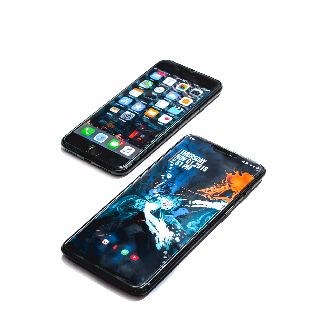
Trend #1: Minimal color usage with a focused color palette
As the name indicates, this color scheme doesn’t overuse colors. Many of our favorite mobile phone apps use minimal colors; additionally, they provide sufficient white space. This kind of design should visibly differentiate between linked and active elements.
A clean and concise color scheme can improve the user experience significantly. This happens due to the natural urge of the human brain to see comforting colors on surfaces that are glaring. On the other hand, using too many colors can adversely impact the user experience.
Read more about it in “The art of minimalism in mobile app UI design”.
Note that using minimal color doesn’t indicate a monochrome design. It is far from that. It just means using the required colors, but not more than that. Even while using a minimal color scheme, a designer can differentiate the app very well.
To do so, the designer can use various tones, tints, and shades within one color. Designers can also adjust the saturation and brightness. Note that using different brightness within one color strains the eyes significantly less than using too many contrasting colors.
Designers must test their color scheme for different mobile platforms like Android and iOS. They should also test their color scheme for different popular devices. The minimal color usage can work especially well if the color scheme goes well with the device.
Trend #2: App color schemes with high-contrast colors
This trend became popular with iOS 7. The thrust is to introduce very bright colors in the UI. A few examples are bright pink, bright green, red, etc. It has the effect of offering a noticeable contrast. The bright colors are often used for important content or ‘Call to Action’ (CTA) buttons.
The advantage of this approach is that users clearly see the CTA button or other key content. The color stands out so much that users’ focus is on taking that action rather than browsing that content. This approach is good when your app has such high-priority actions.
Think of a music app. Several popular music apps have the ‘Play’ button displayed in a very bright color. The contrast it offers against the background makes it crystal clear to users which action is the most important.
This happens because high-contrast colors improve both readability and legibility. Read more about this effect in “Bright colors in UI design: benefits and drawbacks”.
High-contrast color schemes rely on the natural categorization of colors into strong and weak. For e.g., orange is a strong color, whereas white is weak. The human brain reacts to strong colors with a higher intensity. Content in bright colors remains in the memory for a long time. When an app retains the mind space this way, it’s as if the app will have higher user retention.
Designers should also categorize their content carefully before using high-contrast colors. A good idea is to use the same bright color for one CTA button across all screens, for e.g., ‘Buy'. This helps users automatically remember that CTA button, which in turn helps them find it easily on the other screens too.
However, there are some disadvantages to using a high-contrast color scheme. On screens where the text and the background colors contrast very significantly, users will find it hard to read the text. Hence, moderation is important.
Trend #3: Subtle colored shadows
As you would expect in the highly competitive mobile UI design landscape, there is no shortage of ideas. Design experts spend significant effort studying the market and coming up with new ideas. This helps in offering differentiated designs. Subtly colored shadows in mobile UI design are a good example.
Typically, shadows are monochrome. That’s how we have always viewed them. It’s natural that that’s how we had come to expect them in the web and mobile UI landscape too.
However, there are mobile UI design use cases where icons make a lot of sense. Now, by their very nature, you can only offer a limited number of icons.
1,200 top developers
us since 2016
Why? Well, when you use icons in the mobile UI design, you are likely trying to save space by omitting text. This makes you highly dependent on the users. Do they intuitively recognize an icon? Is that icon universally recognized? You are okay then.
On the other hand, if you are using icons that aren't universally recognized or icons that aren't easy to understand, the situation changes notably.
You will likely have quite a bit of churn since users wouldn't understand what they should do from the icon. You haven't provided any text describing the function either. Effectively, you really can't use unknown or little-known icons!
This naturally limits your choice of icons. With a limited number of icons to play with, how do you differentiate your design? Subtly colored shadows make a big impact here.
Within the icon, using bright but muted colors, you can create subtle shadows. It gives an appealing 3D effect to your icons. This stands out as a clear differentiation from the competition. Read more about it in “7 rules for mobile UI button design”.
However, remember that this idea of using subtly colored shadows works when you have a muted background for the icon. Otherwise, your users will find it hard to focus on the icon since the bright background will also demand their attention.
Hence, use this subtly colored shadow design for your icons only when you have the background of the icon in a weak color.
Trend #4: Bright colored iconography
There are apps that require several icons on one screen. Each icon represents elements with potentially equal importance. This is common for apps providing multiple sub-functionalities. Here, you face a challenge of conveying the importance of each sub-functionality simultaneously.
If you decide to highlight only one icon, then chances are that users won’t remember the sub-functionalities. This could curtail the effective usage of your app since users will more often easily find one functionality and focus on that. You need to communicate the importance of all sub-functionalities.
This requires you to make each icon or element stand out. Bright colored iconography addresses this use case. Here, you use bold and bright colors for each icon and element. Users will see the striking appearance of each element.
The bright colors ensure that each icon and element remains in their memory. They will not need to look around for the sub-functionalities again when they return to the app.
You also need to remember one more aspect. Since you are using multiple bright colors for icons and elements, you need to have a background with sufficiently weak colors, for e.g., white. The screen could strain the users’ eyes otherwise.
Trend #5: Pastel, muted colors
Mobile UI design is never a ‘one-size-fits-all' affair. There are multiple reasons for this. One is that a mobile app is a ‘System of Engagement' (SoE). It's not necessarily a transactional system. Transactional systems are often called ‘Systems of Record' (SoRs).
There is a settled set of users for a SoR; for e.g., a corporate internal web app has its functional users. These users don't have a choice. Even if the UI isn't appealing, they will need to use it.
This principle doesn't work with SoEs. A user has choices, many choices, in fact! If the UI doesn't appeal to the user, they may not return to the app.
Now, what do I mean by saying "appeal to the user"? Users are not one monolithic entity. There are numerous users with different requirements. The mobile app ecosystem isn't a monolithic entity either, since there is a multitude of use cases.
The appeal of an app must correspond to its use case. A live-streaming music app signifies fast-paced action. On the other hand, a personal finance app requires calm and cool analysis. The appeal of each app is different. The UI must match the characteristics of the app to create that appeal.
There are apps for which bright, bold colors aren't suitable. Low/medium saturation, soft or subdued shades, and soothing colors are more appropriate. Pastel colors are increasingly becoming a noticeable trend for such apps.
Read more about how you can design with pastel colors in "Pastel color schemes for refined website design”.
Trend #6: Confine the choice of color palettes to black, white, and grey
We can think of this trend as a subset of the minimal color usage trend. This is for apps where the screen displays a limited amount of content. It should also have a very limited number of CTA buttons.
Moreover, the use case of the app should be such that the users' focus will be mostly confined to the content.
This kind of use case makes many other trends redundant since colorful CTA buttons or elements aren't present. Since the user will mostly read the content, designs that resemble the old-fashioned diaries make sense. A white background with black text and CTA buttons can be useful for such apps.
Designers need to be careful while using such minimalist schemes since they are suitable for limited use cases. Read “7 Color Scheme Trends in Mobile App Design” for tips to judge if this is the right scheme for you.
Trend #7: High-contrast, complementary gradients
In a way, this is a variant of the high-contrast colors trend. What is different there is the use of a different kind of gradient. Typically, gradients were of the same color. It’s different here, with complementary high-contrast colors used in the gradient.
Apps with a high concentration of imagery in the content often need to distinctly mark sections of the content. The main section is where the user enters the content. A good example is a social media app.
A user may browse the page of another user and then click for more details. The subsequent page displays images pertaining to the user. While the main section can use a gradient of high-contrast complementary colors, the other sections display the images. The user remains anchored to the profile due to the gradient.
Read “4 ways vibrant colors boost UI design” to know how this approach can enrich the UI.
Trend #8: Colorful illustrations
Apps that require users to understand and use a workflow need illustrations. Many designers now use bold colors and subtly colored shadows within these illustrations. If you want to use this approach, remember to use weak colors for the background.
In a sense, this approach is a variant of the well-known illustration-based design approach that has a wide use even outside mobile UI design. To know more about illustration-based design, read “5 illustration trends”.
Tools to help you choose app color schemes
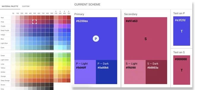
How to find a color palette for an app? I want to recommend a few tools that help you choose colors for your mobile app UI design. Check out these apps:
Planning to undertake a mobile app design and development project?
The market for mobile apps is huge; furthermore, it’s growing rapidly. Mobile apps are expected to generate $913 billion in revenue by 2029, according to this Statista report.
It is just the right time for you, as a business CEO or CTO, to plan your mobile app. However, designing a mobile app that engages and retains the target user base and then developing innovative app features using the latest technologies makes it a complex project that calls for professional app design and development skills.
If you lack such expertise in your app project team, we would advise you to partner with an experienced software development company. One such example is of DevTeam.Space with its expert mobile app developer community.
You can partner with these software developers by filling out your initial app specifications via this quick form. One of our account managers will get back to you for further assistance on team building, project planning, implementation, etc.
Related to the top trends in mobile app color schemes articles
- 5 Biggest Mobile App Development Trends 2026
- How to Build a Karaoke App: 19-Step Development Guide
- DevTeam.Space Blog
Frequently Asked Questions on trends in mobile app color schemes
It is an application that you can install on your mobile device, and it allows you to alter the color scheme of the UI and applications.
Color Hunt, Color, and Coolers are all great examples of mobile apps to alter color schemes.
It is generally accepted that muted colors with less noticeable shadows are a good color scheme. For more of the latest trends, you should read this article.