
Interested in the 10 best corporate website design examples?
This is a great market that is growing rapidly. According to a study, "Web Hosting Services Market will grow at a CAGR of 13.25% to hit $216.59 Billion by 2025".
Other than the huge sums of money that a great website can bring in, innovating in website design is a great way to advertise the qualities of your brand. Here are a few amazing case studies of companies that hired DevTeam. Spaceto build their software products:
- SoBe - Furniture Retail eCommerce Website
- South Florals - Floral eCommerce Website
- ModuleTrade - Healthcare Android and iOS Apps and a website
What are corporate websites?
When it comes to business, appearances are everything. While this statement might not actually be completely true, it does capture a truth about the way business works. No matter whether a company is a small flower shop or a multinational like Microsoft, always projecting a positive professional image is a huge part of the game.
If we consider both those examples for just a second, the two companies are at completely opposite ends of the spectrum and have very different business models. The average flower shop is a family-owned enterprise that buys a single commodity to sell to its local customer base. Microsoft, on the other hand, is an enormous tech firm that has developed a range of different products in order to compete in a highly competitive global industry.
What these two companies do have in common, however, is the fundamental need for their clients to like the look of what they are selling. While in the case of the flower shop, this statement needs no explanation, in Microsoft’s case, this involves a complex set of factors that includes its brand, reputation, quality of its products, and so on.
One of the places that a business can project an image of positive professionalism is on its website. The purpose of any website is not just to function as a way for customers to find information on your product or purchase goods, etc., but also to help reinforce your brand.

Since the first place that most customers/clients go these days when trying to find out more information about a company is its website, having a great site that reflects well on its brand is absolutely essential.
In this article, I aim to examine the 10 best corporate websites to analyze just how they reinforce their company’s brand. I will look at such features as the user interface, functionality, and the use of pictures/logos/tables/graphs, etc., to explain just why I believe they are shining examples of successful corporate website designs.
Contents
What makes a great corporate website?
10 Magical Corporate Website Examples 2026:
Pixar website
Apple website
Amazon website
Clarks website
Hausmann & Co’s site
Washington Post site
NASA site
Bienville Capital
Arte-Charpentier
Prada
What makes a beautiful website design?
1. High-quality, clear images 2. user-friendly, simple navigation 3. website's text, images adapt well to different devices, such as smartphones and iPhones, tablets and iPads, laptops and MacBooks.
What makes a great corporate website?
The simple answer to this question is it’s complicated. The reason I say this is because when it comes to things like style and usability, the range of possibilities is literally endless. More problematic still is the realization that personal tastes differ massively, so while a particular design and layout might appeal to one person, it won’t to another. As I said, it’s complicated.
To give you a good idea of the general features that make a good website, I have compiled the list below:
Functional and Appealing Design
Anyone who has ever tried to build their own website using a platform such as WordPress will have come across the website template. These templates are designed to speed up the process of creating a website by providing a basic structure to build on.
Most website building platforms these days have hundreds of templates that come under specific categories, such as a blog, business, personal, etc. Templates within each of these categories are designed for specific uses, too. So the business section, for example, will include templates for everything from accountancy firms to online retailers.
The reason for this is that over the last few years, users have come to expect certain stylistic traits from related business sites. In effect, we are now at a point when a degree of design harmonization is expected between sites. In the same way that the advent of the font Helvetica harmonized the use of typeface, user expectations are doing the same to styles.
A top company site will, therefore, follow a style that is in line with whatever industry that it is in. Naturally, companies must personalize the style so it is in line with their brand to make sure that it projects the values that they want customers to associate with. So while a law office will choose a style that is conservative and respectable, a fashion clothing label will be brave and catchy.
Increasingly, websites are sticking to a minimalist approach, which is not only appealing to users but also makes sites faster and easier to use. The so-called “flat web design” uses two-dimensional images and large spacing to create a very attractive but functional look.
User-Friendly
Today's users expect a degree of familiarity regarding the functionality of the user interface from all the sites they visit. One such example is the quick link tabs that feature on top of most website homepages. Users need these tabs to quickly navigate around the site and expect to find them where they always do - at the top of the page. If they are not where they normally are, users need to waste time searching for them which often leads to them disliking a site.
A site should feature a familiar page layout that makes it easy to use. Similarly, features such as ordering, payments, etc., should all work in a way that is in line with the accepted standard. While having a site that is original will engage interest with viewers, if it frustrates them because it is difficult to use, they certainly won’t stick around for long.
Great Content
This one is really a no-brainer. A huge part of creating any good website is filling it with great content. While it might be tempting for a company to load up their site with content, this can be a mistake. The real trick is focusing on being precise and making sure that each word appeals to whoever reads it.
Personal Touch
Wherever possible a good website should offer personalization to its viewers. Whether this is done through sign-in accounts or the use of browser cookies (just ask the masters Facebook if you need to know who this is done), the ability of a site to tailor-make the viewing experience for each person makes a site much more appealing.
Personalization involves anything from displaying similar products to those previously looked at (Amazon) to showing averts that relate to a viewer’s hobbies or interests (Facebook). The effect of not personalizing an experience in the way that viewers/members have come to expect has recently been seen when Facebook CEO Mark Zuckerberg attempted to ‘fix’ the site's newsfeed to reduce the number of viral videos that it shows members. According to Zuckerberg, “we made changes that reduced time spent on Facebook by roughly 50 million hours every day”.
The key to creating any truly great corporate website is knowing your customers and giving them exactly what they want, AND what they don’t yet know they want. So with that in mind, let’s take a look at the top 10 corporate website designs.
10 Magical Corporate Website Examples 2026
1. PIXAR
For anyone looking to develop a corporate website that embodies both the minimalist yet iconic approach, then Pixar’s website is a great example to follow. It perhaps comes as little surprise that the first 2 examples of great corporate websites on this list come from tech companies that rose to fame under the tutorship of Steve Jobs, whose insistence on creating the best possible product defined his legacy.
1,200 top developers
us since 2016
The site embodies the Job’s approach. It is simple yet original. A banner advertising one of Pixar’s latest film releases occupies most of the viewable page. At the top of the site, there is the company’s logo along with quick link page tabs. As the reader scrolls down the page, several pictures of the company’s work accompany a short but crisp definition of what the company is all about.
Despite its simplicity, Pixar’s website has all the information to satisfy any visitor. With pages dedicated to past releases, the technology and services it offers, and yet more for careers with Pixar, there is no stone left unturned by this fantastic site.
2. APPLE
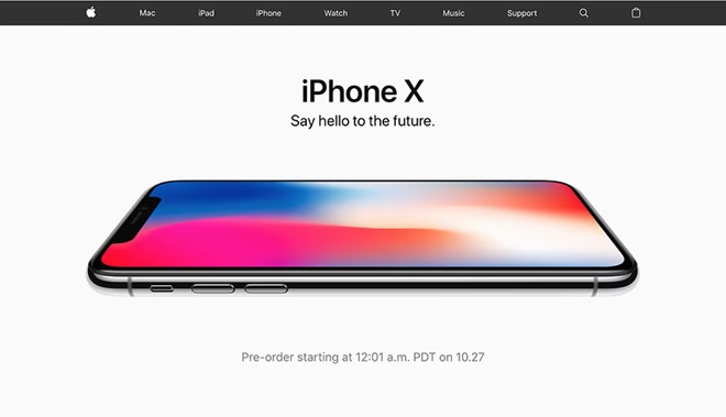
Apple’s website is a fantastic example of corporate website design. It is sleek and simple while at the same time being incredibly elegant and catchy. As you enter the site, you are confronted with a high-resolution picture of its latest iPhone. Rather than showing a face on view of the iPhone’s home screen, the picture shows it lying on its back with a swirl of bright colors on the face. This instantly draws the viewers’ attention and gets them interested in the product.
The site’s background draws attention to the Apple brand and its association with white, while only the most essential quick search tabs line the top of the site. One of the great things about the site is that it seems incredibly simple, but in fact, the site contains a tremendous amount of information, which is spread across lots of pages. It is possible to find everything from store locations to driver downloads, all through this simple-looking site. To access these, users can either use the extremely accurate search bar or use the list of tabs that are located at the bottom of the web page.
3. AMAZON
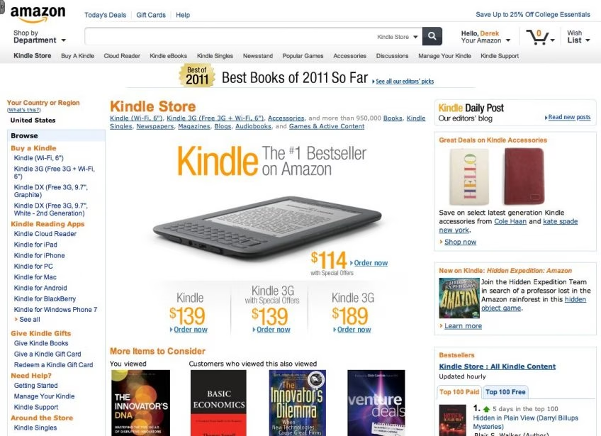
Amazon’s website really is the high-water mark when it comes to online retail websites. The site is available in multiple different language versions and operates a high degree of personalization too. No matter if visitors choose to sign in or not, the site will tailor-make the home screen to offer recommended choices on the basis of past search and purchase information.
The site has 100,000’s of different products and operates numerous different retail models too. Customers can choose to buy straight from Amazon, other members, or even from 3rd party stores. Despite a number of high-resolution images of the various products on offer, Amazon has ensured that the site has amazingly fast page load speeds as well as near-perfect uptime.
Amazon’s site has undergone some huge changes to its interface and continues to evolve to best meet the needs of its customers. In spite of its complexity, it is one of the most reliable and dependable websites in the whole world.
4. CLARKS
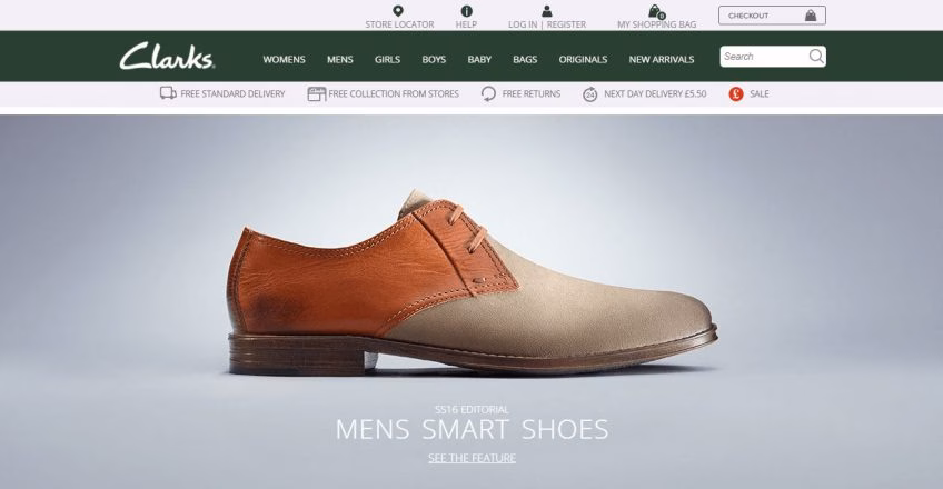
Clarks is a UK shoe manufacturer that operates a high-quality, high-volume business model. Its reputation is built on sophistication and high fashion. Traditionally, it produced formal clothing and shoes, but more recently has begun to try to branch into other lucrative markets that are linked to younger people.
As a result, Clarks has come up with a website design that appeals to both young and old. The site reflects the Clarks brand perfectly, combining elegant pictures of their latest shoes with a high-fashion approach. A photo banner shows alternating promotions in order to advertise the various new shoe collections and promotions they are currently offering. With sections for men and women, a simple checkout process, and a secure payment system, Clark’s website is a model for all those companies that want to make their own corporate website. And what’s more, unlike Amazon’s website, the cost of the Clark site is within most retailers’ budgets.
5. CHHAUSMANN
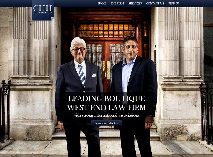
Hausmann & Co’s website is the perfect example of a site that understands the needs of its audience. Take a moment to think about what kind of qualities a law firm needs to project to attract new customers – success, dependability, professionalism, experience, and the human touch are just some of the main tenets of a great law firm.
The homepage reinforces all these thanks to a large picture of the two senior partners standing outside an old London building. While the partners serve to add the human touch, the building clearly projects the image of the firm as being solid, successful, and dependable. Also included further down on the homepage are the profiles of the rest of the members of the company. At the bottom is a contact section and a map showing where people can find their offices.
Chhausmann.com is a perfect example of how a single-page website can hold all the information that a company needs to attract new customers.
6. WASHINGTON POST
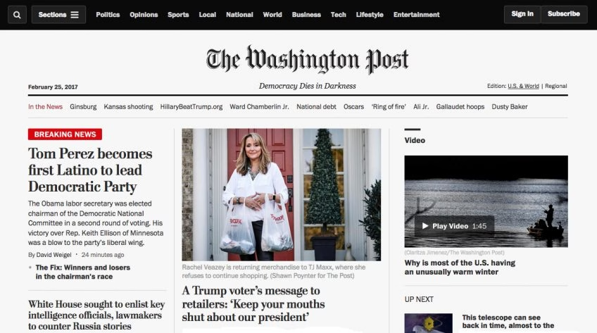
What kind of image does a news corporation want to project? It obviously needs to show trustworthiness, dependability, and respectability, too. Each news broadcaster has its own type of niche market, so its site must reflect this.
While the Washington Post’s logo reinforces its longstanding reputation for excellence, the site's layout helps it to cram as many news stories, ads, and other information into each page without overwhelming its readers. This is important as their article length is far greater than rivals like the BBC or Fox News. Because of this, the concentration required by readers is generally greater, so distracting or overwhelming page designs would not be beneficial to its readers.
The site’s homepage is an excellent example of how to structure large volumes of information without causing readers to feel overwhelmed.
7. NASA
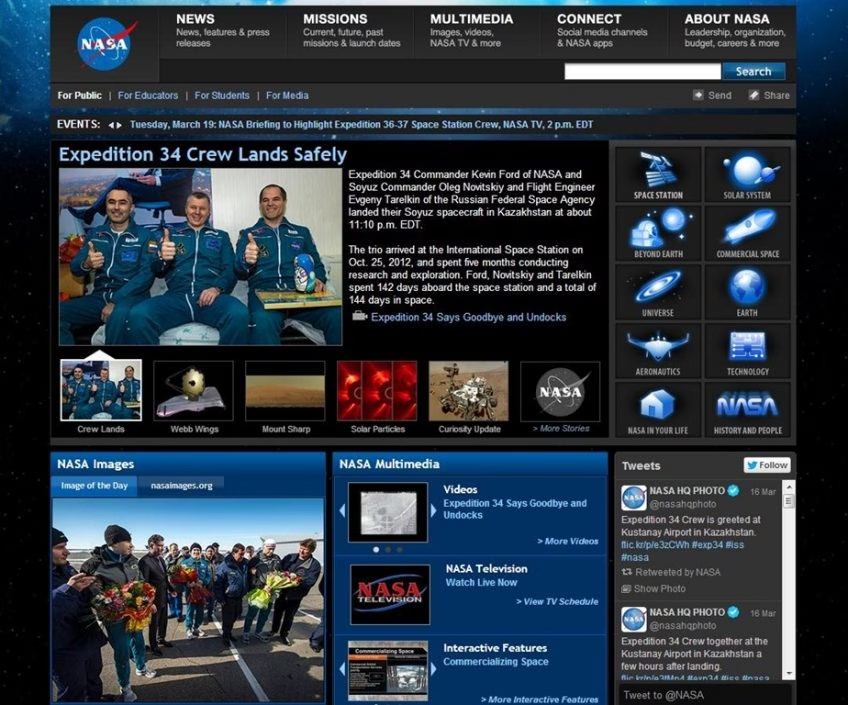
You might expect an organization like NASA to have a world-class website, and if you do, you’d be right. What is really interesting about the site is that it clearly intends to capture the imagination of younger readers. The homepage is crammed with the latest stories, each of which is presented via a captivating picture that grabs the reader's attention. This is clearly a device aimed at appealing to children and young adults, and is something that works perfectly.
The site has quick access tabs to various categories of information to help speed up the browsing process. It also includes a really useful events box that keeps readers up to date in real time about all of NASA’s upcoming events.
8. BIENVIlLLE CAPITAL
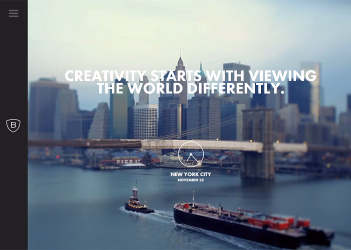
Bienville has opted for a site that offers very little in the way of information, but rather is designed to act more as a web business card to give prospective clients their contact information. One notable feature is that the bottom image subtly changes as readers scroll down the page. This feature really helps to draw attention to their contact information underneath. It is a nice single-page website and stands as a great example of how good pictures and very little information can successfully sell an image.
9. ARTE-CHARPENTIER
Naturally, any architecture firm wants to create an eye-catching website. A great example of is Arte-Charpentier, whose site is incredibly unique and creative. The homepage is a cartoon-like map of a city that has embedded links to the various projects the company has created in the past. Upon clicking one of these links, readers are redirected to the project page, which gives extensive details about the concept and the design the company came up with for each one.
The site does, however, serve as an example of the drawbacks of using a very sophisticated user interface. Often, the map is slow to load on anything but the fastest broadband speeds, something that somewhat spoils the professional image the company has tried to create.
10. PRADA
Prada has ramped up the captivating element of its user interface to the max. Its background is a corporate video that advertises the Prada brand. The film has been incredibly well-produced and reflects the glamour and high fashion that the Prada brand is all about.
Another notable feature is that rather than scrolling down, the homepage revolves from left to right to reveal pictures of various Prada products. The site features only a minimal amount of information that is related to its new catalogs and store locations. It is a great example of a high glam website that is at the cutting edge of originality and fashion.
Contact DevTeam.Space if you need help with corporate website design.
Related to corporate website design articles
- Guarantee Fast Loading Times for Your Website and App
- Top 10 MVP Development Companies I Recommend in 2026
- E-commerce Website Design & Development Services
- 10 Best Influencer Marketing Websites to Find Influencers
- Best Software Design Document Templates
- How to Build a Review Website: 4-Step Development Guide
- Software Deployment Tools: Top 7 Examples
Frequently Asked Questions
It is the field that focuses on the design of websites for corporate-level businesses. Naturally, given the intense level of competition, corporate web designs need to be at the cutting edge of trends and fashions.
The best approach is to hire expert developers with experience in creating corporate websites. There are lots of companies that have extensive experience in corporate website design, including DevTeam.Space. These can help you reach your goals.
The purpose of any corporate website is to attract and retain customers. Many sites need to be effective at maximizing the revenue generated from a user’s visit and gathering as much data about them as is required.
1. High-quality, clear images
2. User-friendly, simple navigation
3. Website's text and images adapt well to different devices, such as smartphones and iPhones, tablets and iPads, and laptops and MacBooks.