

Want to know how to use the Chart.js library for dataset visualization? You've come to the right place. In this blog post, we'll discuss the importance of data visualization and explore how to use the Chart.js Library in the best way.
In this article
- Why Data Visualization Is Important
- What Is Chart.js Library?
- Chart.js Samples
- Limitations of Chart.js Library for Datasets
- Frequently Asked Questions on Chart.js Library
Why Data Visualization Is Important
Whether you have a website, app, or blog, data visualization is a great way to capture your readers' attention. A beautiful graph or chart is much more engaging than trying to comprehend a list of percentages and statistics.
When learning to write for the web, I discovered that readers don't behave the way you expect. They skim the page for images, headings, and keywords. The vast majority won't read the whole page, and 55% will leave within 15 seconds.
Percentage of visitors who leave after less than 15 seconds
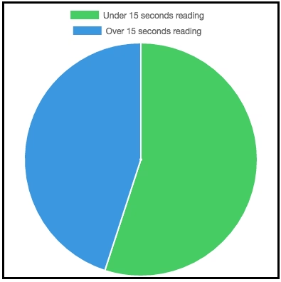
See what I did there?
Having visualizations in your content will help readers comprehend your message. Most of us aren't good at understanding lists of numbers and percentages.

We need a way to visualize these concepts and relationships to make them easy and intuitive. This is especially true of non-English speakers.
Doing this is a win-win, as readers will leave with more knowledge, and you'll have more fans. The trick is to choose relevant data, the right charts, and then use a great tool to create your charts.
There are a few options for creating web charts, but not all charts are created equal.
There are some free-to-use online chart creators such as Chartle and Live Editor. Some of these are free, some paid. They allow you to quickly snap up a line or bar chart with a few clicks.
These will look OK, but probably won't look too persuasive.
The best option is to use a custom solution that lets you graph and animate your content in a unique and professional way. There are a few jQuery data visualization libraries you can use.
The best and most comprehensive (and my favorite) is the Chart.js library for dataset visualization.
What is Chart.js Library?
Chart.js is a cool JavaScript chart library that lets you generate your graphs and charts. It even lets you add some animation to make them stand out more.
It offers features such as:
- 8 different chart types
- Mixed chart types
- Different axis types
- Animation
- HTML5 Canvas
- Responsive sizing
My favorite thing, however, is that Chart.js is completely free and open-source. For all those reasons, I don't see why you would want to use any other JavaScript graph library.
How Difficult Is Chart.js to Use?
Data visualization with Chart.js will require a bit of knowledge of HTML5 and JavaScript. If you've used another JavaScript graph visualization library before, you will find it easy.
Beginners will be able to create basic charts easily. More advanced things, such as using logarithmic scales and animation, will need a bit more time.
If this seems a bit too much, scroll down to the section about finding some help.
What Is Chart.js Used for?
Chart.js is a flexible library. There are 8 types of charts you can make:
- Line chart
- Bar chart
- Radar chart
- Polar chart
- Pie chart
- Doughnut chart
- Bubble chart
- Mixed
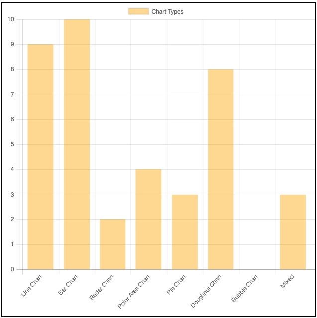
Here's a quick bar chart I made with the different chart types, and how highly I rate them out of 10.
Each type can be customized to have the color, look, and shape you want. You can also mix chart types to make it easier to compare different data sets. Check out the Chart.js homepage for more info and examples.
In this post, I'll be looking at how to visualize data with Chart.js, some examples, and where you can go for more information.
Setting Up
Chart.js is focused on being easy to set up and learn. All you need is the library and a <canvas> An element in your HTML to get going.
I'll be using the CDN to include the library - using this script tag
<script src="https://cdnjs.cloudflare.com/ajax/libs/Chart.js/2.1.4/Chart.min.js"></script>
The only other thing you'll need is a <canvas> element in your HTML
<canvas id="myChart"></canvas>
If you're more of a code geek, you can check out the GitHub project to really get your hands dirty.
1,200 top developers
us since 2016
Chart.js Samples
Let's look at some simple examples of things you can create with Chart.js.
Chart.js Line Chart
Line charts are one of the simplest types of graphs. They consist of an X and Y axis, data points, and a line between them.
Here's an example of a line graph made with Chart.js. It plots the average hours of sleep I get per night during a typical week.
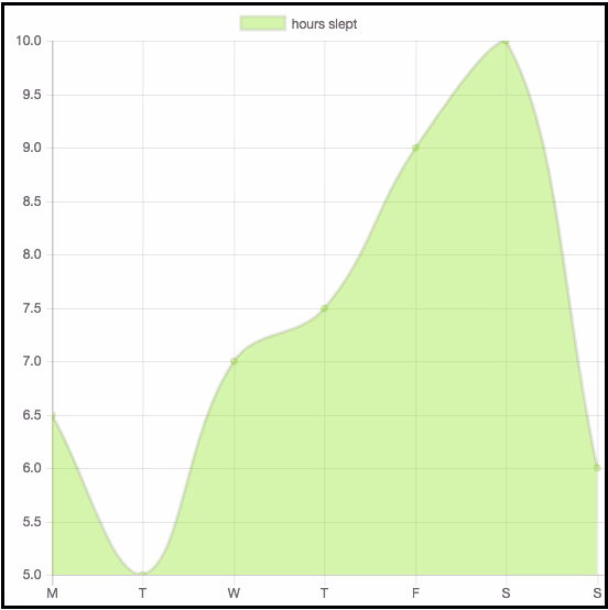
As you can see, I definitely need to fix my sleeping pattern. The good thing is that I created this chart in just a couple of minutes.
All you need to do is include the setup tags I mentioned earlier, and have a JavaScript file with the following code:
var ctx = document.getElementById('myChart').getContext('2d');
var myChart = new Chart(ctx, {
 type: 'line',
 data: {
 labels: ['M', 'T', 'W', 'T', 'F', 'S', 'S'],
 datasets: [{
 label: 'hours slept',
 data: [6.5, 5, 7, 7.5, 9, 10, 6],
 backgroundColor: "rgba(153,255,51,0.4)",
 }]
 }
});
This code might look a little complicated, but there is nothing to worry about. All charts are set up in the same way, so we can make minor changes to generate completely different graphs.
This doc shows some important line graph functions like ShowLine, to not display a specific dataset, Label, to add a chart description in the legend and tooltip, etc.
It also entails function types like string, boolean, etc, along with their default values. For example, the default RGB value for borderColor, backgroundColor, etc., is rgba(0, 0, 0, 0.1), and the default value for borderWidth (line width in pixels) is 3.
After some initial setup, all you need to do is add some data and labels. Have a go at playing around with this code to get some different line graphs going.
Also, try resizing your browser window. You'll notice that the chart changes size accordingly. That's because chart.js is responsive by default, making it easy to incorporate into your responsive website or app.
You can manipulate the size in other ways, but that's for another tutorial.
Chart.js Bar Chart
Let's look at the bar chart I made comparing the different types of charts.
I love bar charts (as you can tell by my 10/10 rating). Luckily, like the line charts, this is easy to do. Here is the code I used to set it up:
var ctx = document.getElementById("myChart").getContext('2d');
var myChart = new Chart(ctx, {
 type: 'bar',
 data: {
 labels: ["Line Chart", "Bar Chart", "Radar Chart", "Polar Area Chart", "Pie Chart", "Doughnut Chart", "Bubble Chart", "Mixed"],
 datasets: [{
 label: 'Chart Types',
 data: [9, 10, 2, 4, 3, 8, 0, 3],
 backgroundColor: "rgba(255,153,0,0.4)"
 }]
 }
});
As you can see, the only difference is that the type has been changed from 'line' to 'bar'. This demonstrates some of the power of this library and how it can be used to efficiently create all kinds of things for your site.
Chart.js Pie Chart
Line and bar charts are easily interchangeable. Different types, such as pie charts, need a few extra things.
You can just change 'bar' to 'pie' in the code above to get a pie chart (try it out). But, for pie charts, we ideally want a different color for each 'piece' of the pie.
Here's the code for a pie chart I made showing the proportions of people using different internet browsers:
var ctx = document.getElementById('myChart').getContext('2d');
var myChart = new Chart(ctx, {
 type: 'pie',
 data: {
 labels: ['Chrome', 'Safari', 'IE', 'Firefox', 'Other'],
 datasets: [{
 backgroundColor: [
 "#2ecc71",
 "#3498db",
 "#95a5a6",
 "#9b59b6",
 "#f1c40f"
 ],
 data: [40.7, 23.9, 15.3, 11, 9.1],
 }]
 }
});
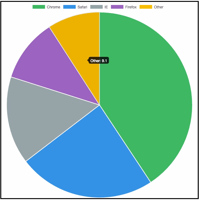
We added a few different colors for each segment, and that's it!
Mixing Chart Types
Another cool thing about Chart.js is that you can mix chart types. Just make the overall type 'bar' and add different types to different datasets. Here's a toy example about apples and oranges on different days of the week:
var ctx = document.getElementById('myChart').getContext('2d');
var myChart = new Chart(ctx, {
 type: 'bar',
 data: {
 labels: ['M', 'T', 'W', 'T', 'F', 'S', 'S'],
 datasets: [{
 type: 'line',
 label: 'apples',
 data: [12, 19, 3, 17, 6, 3, 7],
 fill: false,
 borderColor: "rgba(1,255,51,0.4)",
 backgroundColor: "rgba(1,255,51,0.4)"
 }, {
 label: 'oranges',
 data: [2, 29, 5, 5, 2, 3, 10],
 backgroundColor: "rgba(255,153,0,0.4)"
 }]
 }
});
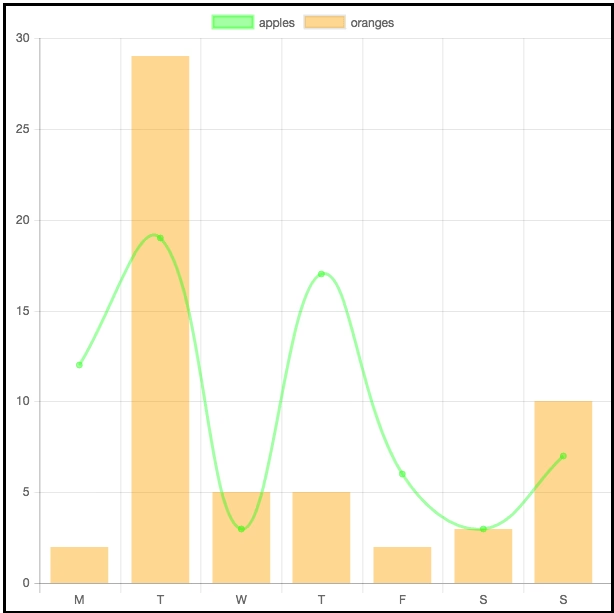
This is a nice tool for comparing different datasets.
Config Options
All the charts in chart.js come with a configuration option. You can change the behavior of charts using it. Some common properties that you can specify are beginAtZero, indexAxis, etc.
If you want to apply configuration settings to all chart instances, you can use the overrides property.
For example, Chart.overrides.line.spanGaps = false; will apply spanGaps = false to all line charts that you create after configuring this change.
There are options for global configuration and dataset-type configuration. Read more details here.
Chart.js API
It enlists all the global methods for each chart in the shared chart type. You can use .destroy() to delete all the previous chart instances, and .update() triggers updates you have made to the data object, like updating the first dataset value, etc.
Plugins are another way to change the default behavior of charts. They are shared between different chart instances by introducing them as a constant like const plugin = {/*plugin code*/}
Chart.js Other Charts
There are more types of charts to make your data even more appealing. Take a look at the Chart.js documentation for a detailed description of all the types and how to use the Chart.js library for dataset visualization effectively.
Once you get past the basics, you can start doing things like changing the shape, style, and color. This isn't as difficult as you might think. Just playing around with a few parameters can give you a unique look and feel for your brand.
Also, the library can bring things to life with movement and animation.
Limitations of Chart.js Library for Datasets
Of course, every library and tool has downsides. When using Chart.js, you'll be restricted in what you can create. If you go through the documentation and can't find something that looks even remotely like what you want, you might have to look for another solution.
Here is a blog on building a Node.js solution according to your requirements.
Planning to Use Chart.js for Dataset Visualization?
If all of this seems a little too much, or you want to create charts and animations that REALLY stand out from the crowd, you might need some help. Learning JavaScript from scratch can be a pain, and you might not end up with exactly what you want.
Luckily, there are developers who specialize in using Chart.js for dataset visualization. They will be able to integrate it with what you currently use or build it into a project from scratch.
Here are our guides on hiring remote software developers and managing them effectively.
You can also get in touch with DevTeam.Space by filling out this form and have expert developers create complex, customized visualizations for your business.
There is so much more to learn about Chart.js for dataset graphical representation. To get stuck into some more code, take a look at the documentation.
You can also check out the Chart.js homepage for more information about what it is and what you can do.
Related articles on using the Chart.js library for dataset visualization
- 10 Popular Machine Learning Tools
- How to Build an AI Agent: 7 Steps
- What Is an IDE (Integrated Development Environment)?
- What are Non-Functional Requirements: 14 Examples
Frequently Asked Questions on using the Chart.js Library
Chart.js is an open-source JavaScript library that allows data visualization. It is widely considered one of the top visualization libraries. It currently supports eight chart types that include bar, pie, area, line, polar, bubble, radar, and scatter.
Chart.js for datasets is the developer's favorite when it comes to chart libraries. It supports 8 charting types while being very easy to use. It is free to use and is well supported by a large open-source community.
If you are not happy with using any existing charting libraries, then you will need to onboard a developer who has the skills to create a new charting library from scratch. The process is relatively straightforward for anyone with the relevant skills and should be done in a matter of weeks.