
profile
By Yury
Wondering which visualization tool is best for big data? Big data visualization tools are essential when it comes to harnessing the valuable information that lies behind this data. We've hand-picked 10 of the best big data visualization tools for 2026, which stand out with their performance and usability.
In this article
- Big data visualization tools for non-developers
- Big data visualization tools for developers
- Top 10 Big Data Visualization Tools Chart
- Frequently Asked Questions on big data visualization tools
This blog discusses a list of big data visualization tools. I've split them into two categories, for non-developers and developers. The non-developer data visualization tools provide a nice graphical user interface, while the developer tools require some programming and offer more flexibility.
Before we dive deep into the topic, let's recollect what data visualization is. Data visualization is a graphical representation of data. It can be presented as charts, graphs, diagrams, geographic maps, sparklines, infographics, heat maps, etc.
Big data visualization tools for non-developers
Big data visualization tools for developers

Let's take a look at each one in detail.
Top 10 Big Data Visualization Tools Chart
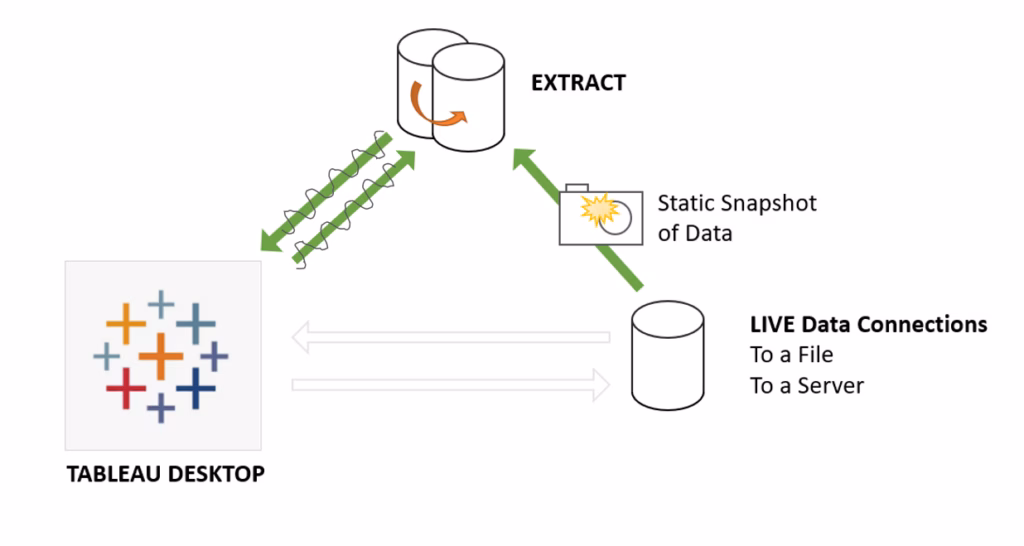
1. Tableau
Tableau is a software company that focuses on creating top data visualization software. It's based in Seattle, Washington, and is viewed as one of the companies making the best online data visualization tools.
It's noted as one of the first tools for big data to give businesses the power to create interactive visualizations from a data source, without the need for a data scientist or even a specialist IT support.
Access to this kind of business intelligence is invaluable for any company, and Tableau is bringing it to the masses through an easy-to-use interface and an interactive dashboard.
It is offered as a SaaS (Software as a Service) application for
- Desktop,
- Server,
- And online (as a cloud app)
The company offers great support, and the community is strong. You'll be able to find a guide or tutorial for just about anything.
The downside (as with many similar products) is the cost. It's free for students, but the cost can quickly skyrocket. Costs for medium businesses can reach hundreds of thousands of dollars per year.
2. Datawrapper
Datawrapper is a tool targeting publishing firms and journalists. It has an impressive list of clients, including:
- Vox
- Buzzfeed
- The Washington Post
- The Wall Street Journal
Like with Tableau, you don't need any coding knowledge to write any code for interactive visualization of data from multiple data sources. Just upload your data and get back what you need. You can easily integrate your creations with your site and even use and take advantage of local maps.
It's a little more affordable than Tableau, and is now free for up to 10K chart views.
3. RAWGraphs
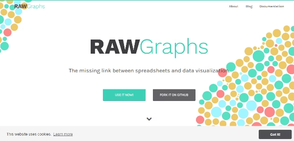
RAWGraphs claims to be the "missing link between spreadsheets and data visualization". It's a web app that offers a fairly easy-to-use copy-and-paste interface and sends out professional-looking graphs. One of its biggest selling points is that it's free. Completely free.
It also offers some other cool features like:
- Easy export to 3 data formats or an embed code
- Compatible with Sketch, Adobe Illustrator, and Inkscape
- No registration required
The app is designed with "designers and visual geeks in mind", so you have a lot of flexibility. Also, despite being a web app, RAWGraphs doesn't process any of your data — it's all done by your web browser. This means you know your data is kept safe because you're the only one who ever sees it.
Overall, RAWGraphs is great if you are looking for one of the most professional, free, open, customizable, and best data visualization tools.
4. Canva

1,200 top developers
us since 2016
Build custom pie charts in just a few easy steps. Simply use the platform's easy drag and drop features along with its comprehensive library of graphics, and you will be creating professional-looking charts in no time.
All charts will be safely stored and accessible anywhere/anytime, thanks to the platform's cloud storage. Already, thousands of businesses all over the globe are using Canva to create top-class visual representations of their data.
5. Plotly
If you are tossing up which data visualization tools to use (as you are reading this, there is a good chance you are!), Plotly offers some great samples. This can give you an idea of what you can expect, and you can expect a lot.
Used by organizations as diverse as the U.S. Air Force and Google, there is surely something you'll find useful. They have a user-friendly web tool, which means no installation requirements for you. One thing I really like is that you can post graphs directly to social media for your friends to interact with and explore.
It's possible to create interactive charts and collaborate with colleagues easily. Also, for developers, there's an API you can plug into for great customization and flexibility.
Plotly offers data science workspaces and an AI catalog for low-code development of AI and data science apps. You will likely need a team of data scientists and data analysts in your team to make a data visualization application through Plotly and efficiently work with your business data through appropriate visualization methods.
Visit our blog for some tips on hiring data scientists. Take a look at some experienced data engineering developers at DevTeam.Space.
Another cool feature of Plotly is the ability to upload a chart and its data with just a static image. That means you can simply scan a chart and Plotly will figure out what it means and the data behind it. Awesome!
6. D3
D3 stands for Data-Driven Document. It's a JavaScript library for visualizing just about any kind of data you can think of.
To use D3.js (and most of the other tools mentioned after this one), you'll need quite good JavaScript skills. The graphics are rendered using HTML, SVG, and CSS — meaning you can't use older browsers that don't support SVG.
The library is fast enough to support large, real-time data sets to make your charts come to life. It also allows animation and even interaction.
Coders will be happy with the built-in components and plugin mechanisms. With these, you can create neat and reusable code for later projects.
7. FusionCharts

FusionCharts is another JavaScript library aimed at both web and mobile applications. It was first released back in 2002 and has since made quite a name for itself. The documentation and tutorials are great for beginners and super for users looking to get into the nitty-gritty.
Some of the main features of FusionCharts include:
- 100+ chart styles
- 2D and 3D charts
- Input data in JSON or XML format
- Charts are rendered in HTML5, SVG, and VML (Vector Markup Language)
- Available in 120 countries
- Animation
- Helpful tooltip
- Zooming, scrolling, and panning through graphs
- Native jQuery integration
- 2,000+ maps
It's not hard to see how they've managed to bag big clients such as Google, Microsoft, and Intel. It does cost money for commercial applications, starting at $149 for smaller deployments.
8. Google Chart
Anything with Google's name stamped on it is probably going to be good. The Google Charts project tries to focus on ease-of-use for developers, and it certainly achieves this goal.
The tools manage to strike a good balance between being simple and also giving developers the opportunity to get really stuck into the code.
VML support means users with older browsers aren't left out, and everything is portable to iOS and Android. The most exciting thing, though, is that it's a completely free project.
With Google backing it, you know it's going to keep getting better.
9. Chart.js
Chart.js is a great open-source big data graph visualization tool. I actually wrote a tutorial recently explaining how to use it on your own blog. It's relatively small compared to some of the other projects on this list, but I love it.
The library itself is tiny, weighing in at only 11 kilobytes. You can even make it smaller by removing any chart types you don't need. The charts are all built on the client-side.
In that tiny package, you get six chart types:
- Doughnut
- Pie charts
- Polar
- Line charts
- Bar charts
- Graph
The library doesn't have all of the bells and whistles that FusionCharts has. For example, the charts are rendered using HTML Canvas, so there is no interactivity available.
But it's still a nice choice if you're looking for something easy. Moreover, Chart.js is free under the MIT license, so you don't need to worry about hefty fees.
10. Highcharts

Not many big data visualization tools can boast of being used by 61 out of the world's 100 biggest companies. HighCharts offers more interactivity than Chart.js and is more mobile-friendly, too.
The feature list is quite similar to FusionCharts, and there is also a nice JavaScript API that works nicely with jQuery. Charts are rendered with SVG, having VML to fall back on for older browsers.
There's also a cloud service you can use if you need big data visualization in the cloud.
It's free for non-commercial use, and deployment licenses start at $390.
Interested in Using Big Data Visualization Tools?
Using good data visualization tools can improve your business intelligence remarkably. You will get better insights into user data, operations data, etc. Moreover, you will be able to turn these insights into actions that will help your business grow swiftly.
Whichever you choose from big data visualization tools, you'll need to make sure you know how to get the most out of it. You can either learn yourself or find a team that has the experience and knows how to visualize big data in an effective way.
If you are still looking for data engineers and developers to help you with the implementation of a data-driven transformation for your business via visual representation of data and interactive dashboards, DevTeam.Space can help you.
You can get in touch via this quick form describing your initial data analysis requirements. One of our technical managers will get back to you to further answer your questions in detail and to connect you with expert data engineers.
Related articles on big data visualization tools
- Software Development Tools - The Top 12
- 10 Popular Machine Learning Tools
- Software Deployment Tools: Top 7 Examples
- 5 Ways to Implement Predictive Analytics in Business
- 10 Best AI Development Tools: For Developers
- 10 Best AI Tools in 2026
- What are the Best SaaS Analytics Tools for 2026?
- 20 Best AI Apps In 2026
- How to Use Chart.js Library for Dataset Visualization?
- 7 Best AI Software Development Tools 2026
- 10 Software Development Trends in 2026
- AI Software Development Life Cycle: 11 Steps
- 8 Best AI for Coding Tools in 2026 I Reviewed Hands-On
- 10 Best AI Development Tools: For Developers
- 10 Best Software Documentation Tools in 2026
- Top 10 ERP Software Development Companies I Vetted (Recommended for 2026)
- What is a Data Mashup?
Frequently Asked Questions
• Google Charts
• Tableau
• FusionCharts
• Microsoft Power BI
Google Charts is very user-friendly and simple to use for all your data exploration from multiple databases, including CSV files, SQL databases, etc. Also, it is a powerful tool that allows users to create some great data visualizations like heat maps, vector graphics, scatter charts, etc.
You can decide on a BI tool to analyze data in visual formats by going through the following:
• Decide on your desired output
• Assess all the features of the relevant visual analytics tools
• Choose the most suitable one.